Friday, May 1, 2015

Trends in Graphic Design

What is trend?

Trend is never constant, it changes with passing time, every-time.

About Trends

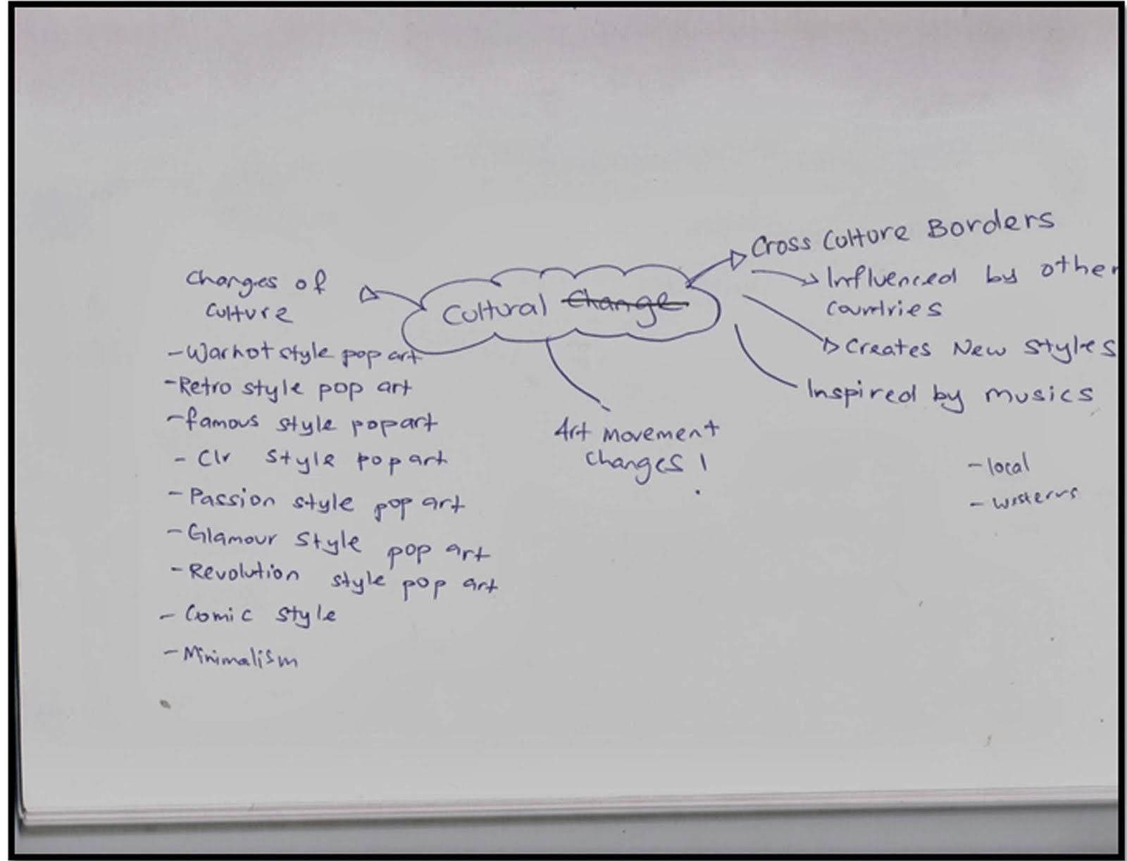
One wonderful trend we’re noticing in graphic design and illustration an acceptance and celebration of our own unique, local experiences and using these as inspiration for substantial concepts or for creating innovative styles. 

However, there will always be those shiny, tempting design trends that initially just look so cool, and eventually become lazy cues for a concept, culture or theme. In the internet-driven world we live in it can be difficult to pinpoint the origins of a trend and they gain traction exponentially faster than before we were able to share things with a massive audience online. What this means, at times, is that it feels like we’re seeing the same thing eeeeverywhere. ()

Being a graphic designer, it is important to know the trends that are circling you field.

"The graphic design industry evolves in leaps and bounds not only through the various technological advances made in design software, cameras, computers etc., but also through the trends in colors, ideas and customer tastes. 
A graphic designer needs to be well read, and have the necessary skill sets to adapt easily from one trend to another. "


Below are trends that are currently being mostly used


Flat Design


Microsoft
  • The new Windows 8 Start screen is now powered by Live Tiles (animated, notification-like widget) sorted in grids with a horizontal scrolling layout that takes advantage of common landscape displays.
  • Windows 8’s Modern UI is based heavily on the Bauhaus movement, founded by architect Walter Gropius, including proponents of the school’s philosophy Ludwig Mies van der Rohe, Le Corbusier and modernist painter Piet Mondrian. It was also inspired by metro transit signs in terms of icons and typography.


Google

  • Google’s card-based design can be seen most notably on Google Now. The use of white spaces and condensed Roboto typeface make the overall layout very clean and easy to digest. The design, while considered flat, still uses subtle gradients and shadows as elements to aid highlighted, stacked cards. 
  • Textual information is organized per size and color and in order of importance. Title headers are usually larger and dark while descriptive copies are grayed and sometimes italicized. Google’s use of flat-toned vector illustrations and icons also echoes the company’s dedication to clean and modern design.


Apple


  • With iOS7, Apple introduced the use of blurred translucency to provide a sense of context and place for the onscreen elements. The new version also introduced a thinner, modern-looking typeface in the form of Helvetica Neue Light. This fits the overall new user interface with a lighter and breathable layout especially in the Mail and Calendar app.


Pros and Cons : Flat design


Pros


Simple mobile interface design


Bright color sets the mood


Visual are sharp and clean


Focus on beautiful type


Cons

  1. Too simple of a interface, people might have usability problems
  2. Weak Typography becomes obvious
  3. Flat design/icon can look too simple


Grid Layout

Grid layout started out with Pinterest. Grid layout a user experience that is great for tangible product based businesses. This layout allows users easily to view each item on bye one in a structural manner.


Pros

  • Massive content are evenly distributed to columns and rows, making a compact arrangement with its own visual rhythm
  • Does not feel chaotic and messy, instead looking clean and structured
  • Grid layout offers a level of stability to the structure


Cons

  • Grids may cause boring, stating designs.
  • Some people claim it makes you less creative, they are trapped within its borders.
  • May not be suitable for all cases and sometimes cannot satisfy a specific web design specific.


Geomtrical shapes


The geometric trend has taken root because of it’s simplistic and clean design, so a lot of graphic designers have been working away on trying to push the boundaries on what can be done with geometric design. Whilst doing so they have been creating some gorgeous masterpieces.

Don’t be fooled by apparent simplicity though — the level of skill and attention required to produce this kind of work


Illustration

As companies attempt to invoke an emotional response in their audience, they will employ the soft, appealing nostalgia of the hand drawn illustration as opposed to the blocky, futuristic and possibly intimidating feel of digitally rendered illustration.


Infographics

Infographics is information or data that is presented using a visual image or diagram. Personally, info graphics is one of my favorite "design trends" out there, using visuals to convey an information that is harder to understand in text. For people who likes to learn about new things but doesn't really want to read a giant book, will find info graphics light and easy on the easy and brain.

But infographics is not by any means a walk in a park. The purpose of an infographic is to make the data/information clear. Finding the balance of just enough is crucial.


Conclusion

Trends are not all bad. It’s more of a matter of application, where the success of any given piece is determined by an abidance of things such as skill, craftsmanship, subject matter, concept and of course, personal taste.


Sunday, June 8, 2014

The psychology of happiness

Happiness is life experience marked by a abundance of positive emotion. Feelings of happiness and thoughts of satisfaction with life are two prime components of subjective well being. Are people happy? most people report of being "fairly" or "very" happy and few being "not too happy." Happiness as nothing else that an emotion, a long-term sense of emotional well-being and contentment. Happiness is commonly considered by psychologists the main way we can evaluate how well our life is going. As such, how happy a person feels  is perhaps the single, most important piece of information one can know about a person – for it usually tells the whole story. Because of this, happiness should be the most important thing to considering in examining your own life.


Happiness scientifically.

Happy Brain, Happy Life
Happy brains are more creative, quicker, and more mentally alert.


What science taught us about happiness

  1. High status brings low ethics
  2. Happiness is about respect, not riches.
  3. Kindness is its own reward
  4. We can train ourselves to be more compassionate
  5. Gratitude sustains relationships through tough times
  6. Humans are quicker to cooperate than compete
  7. There is a dark side to pursuing happiness


Sunday, June 1, 2014

[SEM 6 WEEK 3]


Tone 

 The tone for this video i would like to have a teen subject, and what is his/her happiness, shows scene of what situation and things that makes him/her happy

Mood 

I want the mood to be happy (go figure) and lightheaded with a dash of silliness and seriousness. I want it to be a feel good video, when every time you watch it, it evokes this warm and light feeling.

Image 1

Image 2


Images 1 & 2 shows the screens cap i took from my favorite movies and short film creator. The short film creator being Nanalew and Meekakitty. The movies are Her and 500 days of summer.
The thing they have in common is their mood and setting of the scenes, to me it feels very warm and good, it's those kind of movies and videos i could watch countless of times.


Design Specialism [SEM 6 WEEK 2]


Title

Happiness to me is

Concept

What does happiness means to me, is it the same as everyone else? Does the small things that makes me happy is considered big to someone else? How do i define my happiness.

Idea

I want to show that happiness comes from within, happiness does not discriminate. It always needs to come from you. At the end of the day, what does happiness means to you?


Image 1 
Image 2 
Image 3


Image 1 & Image 2

These two images consists of the research i conducted to find out what does happiness means to different people, i found out from people with different age, background, race a total of 50 people. From what i concluded, most of the things that makes them happy is more or less the same. what i conclude from this research is that happiness is not bias to a certain race, people with different background and age.


Image 3

This image shows the subjects that i will likely be using for my videos. The other one is how i researched on what is happiness from a array of websites, how they define happiness.


Design Specialism [SEM 6 WEEK 1]

The topic i chose to do is about happiness, what is the meaning behind happiness. The media i chose to portray and present my work is video. I believe that video is the best way to show happiness in full form.

Things i need to research:


  • What makes people happy?
  • Style and mood of the video
  • Concept
  • Title
  • Idea
  • Subjects
  • Research on what is happiness

Thursday, February 6, 2014

[WEEK 1] [PPB] Sketches


Manual sketches for the app, tagline, icons and t-shirts. We decided to go for a typographic approach.

Sunday, December 1, 2013

DESIGN SPECIALISM

DESIGN SPECIALISM (FLUX 1)


For this assignment of flux we were assigned to identify changes in graphic design and discuss the new trend in design. Therefore, the topic that we choose is “GLOBAL COMMUNICATION”. This is because think by nature many designers are introverted and do not naturally have strong communication skills (of course this is a generalization) . Most of us enjoy working on our own and creating something special, but communicating with clients and colloborating with other designers plays a main role . Communicationskills can affect your performance as well globally.

How we started


At first we tried to research about the flux in the fields in graphic design such as typography,illustration,advertising,photography,printing technology and multimedia.Therefore, we listed what are the changes in different areas.


Social Change


For social change we listed down the changes  such as how social media connects the world and how social media can be used to promote artworks .

Cultural Change


For cultural change we listed down the changes in art movements,cross culture borders and influences


Research

Some of the research that push us towards our final product, researched on the future of a graphic designer, what will design look like in the future. Layouts for the info graphic poster.
Changes in games (graphic, consoles). Changes in photography (the camera, software use to edit)


Final Outcome 


We put in all the information in four separate columns, which is social, new medium, trend of the future and cross culture

Cross Culture

How through global communication, how people from different cultural background can work together and maybe share their how their culture influence their work.

New Medium

How these people share their work through this abundance of medium for people around the world to see.

Social

Social where people can discuss and advertise.

Trend of The Future

How the design will look like in the future.


Reflection

Upon completing this task, i've learned about different types of mediums where people can share their works, see a glimpse of how design will look like in the future and how the changes of graphic design has progress throughout.